
Now there’s a title that will strike fear into the heart of anyone that knows me.
Seriously though, I may have developed a bit of a reputation for my shitty parody covers, but I like to think that I have a good eye for the more serious book covers. Luckily, we’ve had a fair few fantastic (heh!) pieces of cover artwork pop up in the genre this year, so I figured I’d share a few of (what I believe to be) the best.
Please note that not all of these books were released in 2017, as there are books from previous and future years included in this list. However, the actual artwork is all from this year.
And so, without further ado, lets see what we have…
10. Red Sister by Mark Lawrence (UK Hardback)
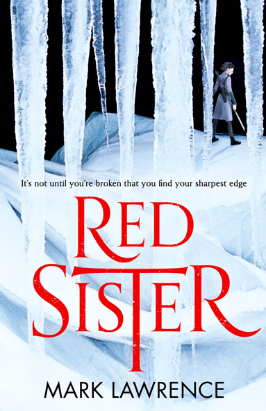
I’m a big fan of covers which can get the mood of a novel across, and I feel the UK edition of Red Sister does a much better job than that of the US edition. We see Nona, always ready to fight, and she’s dwarfed by all of this ice—which is a great indicator of the setting. The text is simplistic, and draws the eye. Perhaps my only complaint is that the icicles can seem a little blurry on close inspection, but honestly… I didn’t even notice that until a friend pointed it out.
Tam has reviewed Red Sister in the past, and you can read that here.
9. Red Season Rising by D.M. Murray
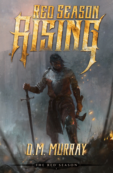
This is a great cover, with plenty of promise of action. You’ve got that lone warrior standing in the ruins of a battlefield, a weapon in each hand. His pose really sells that sense of fatigue, and then there’s the awesome, fiery, jagged typography which complements the scene very well.
This cover was made by the “Dream Team” of John Anthony Di Giovanni (JAD Illustrated) and Shawn King (STK Kreations). These two have worked on a fair few covers together, with Giovanni providing the artwork, and then King coming in with his typography expertise to tie everything together. You’ll be seeing a bit more of these two on this list.
8. Ghosts of Tomorrow by Michael R. Fletcher
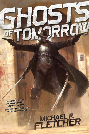
Well, I wasn’t lying when I said we’d see more of Giovanni and King. Just look at that cover, though. It just screams “menacing”. Michael actually went into detail about the many steps they took to find the correct pose for this character over on his website, and judging by the cover… I’d say that work paid off.
7. Children of Blood and Bone by Tomi Adeyemi
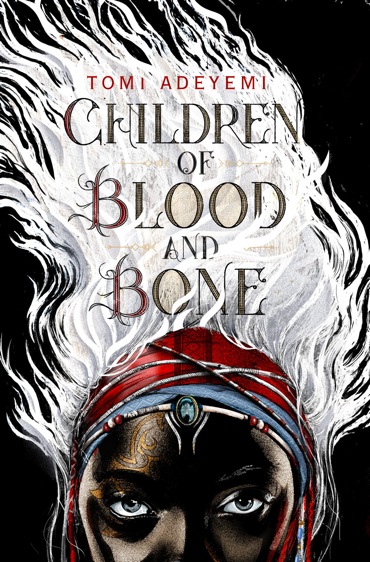
Striking, no?
It’s a very simplistic, very well designed cover. Just by looking at it we can tell what our main character looks like and what kind of setting we’ll be exploring. This is probably one of the most eye-catching covers on this list, and I love that you can see the African roots of the story at a glance.
Now, technically this book doesn’t release until 2018, but the cover art was revealed this year. I’m sure that by 2018, you’ll be seeing a lot more of it.
You can read my review of Children of Blood and Bone here.
6. Paternus by Dyrk Ashton
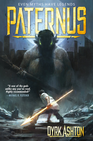
I picked up Paternus via an audiobook giveaway that Dyrk organised at the start of this year, and while I loved it… the cover it had back then did not fit the story at all.
Thankfully, the Dream Team of Giovanni and King (again) stepped in to design this wonderful, action-heavy scene. This fits the book so much better. There’s big fuck-off monsters, Gods, werewolves, vampires, goat-people, bear-people, magic weapons… everything. This cover really does a great job of getting that across.
5. The Bear and the Nightingale by Katherine Arden (UK Hardback)
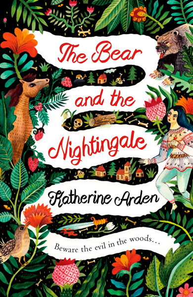
Now, Katherine Arden has been exceptionally fortunate. Every cover for the Bear and the Nightingale, be that UK, USA, Hardback, Paperback… they’re all gorgeous. Hell, even the covers for the sequel, Girl in the Tower are gorgeous. For me though, this is the pick of the bunch.
You are immediately aware of the fairytale theme of the story, and I find that very important. More than that, though, is the way in which this cover seems impish and childish at first glance, but then gets more sinister as you look closer. Sure, there’s horses and flowers and a little bird… but there’s also skulls, bones, and a sword. For me, this fits the fairytale-esque-yet-spooky tone of this book to a tee.
You can read my review of The Bear and the Nightingale here.
4. A Star-Reckoner’s Lot by Darrell Drake
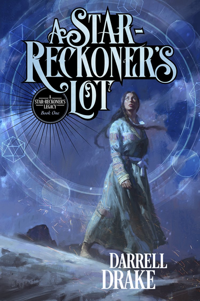
Yet again, this is a cover designed by the Giovanni and King team. Yet again, this is the second cover for a book where the first cover didn’t quite fit.
This one though, is truly gorgeous. You have the main character, Ashtadukht, dressed in which I am told is the authentic clothes of the Sasanian period of Iran, and behind her is the night sky, and a promise of magic. The typography of the title is gorgeous too, and again complements the artwork rather than distracting from it. It’s also very clear that this is book 1 of a series, which is very important from an author’s perspective.
I do kinda wish that something a bit fancier had been done with the author’s name, but then again I’m not the expert.
Read Tam’s review of A Star-Reckoner’s Lot here.
3. Amberlough by Lara Elena Donnelly
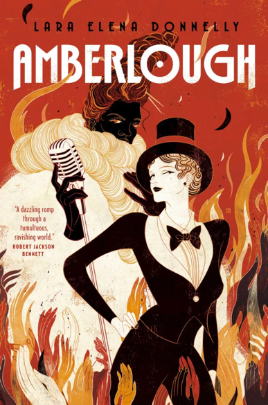
This cover art, by Victo Ngai, fits Amberlough perfectly.
Tor once described Amberlough as “Cabaret with a Touch of Fantasy”, and I think that you get that feel from the poster. It has that kinda Art Deco feel to it, which fits with the 1920’s Europe-inspired setting. Better than that is that a lot of things in this cover serve more than one purpose. The hands of the crowd are also fire. The white jacket of the performer is white smoke, and his black and red hair is the darker smoke.
Even if this wasn’t a book cover, it’d be a fantastic piece of artwork on its own.
2. Those Brave, Foolish Souls From The City Of Swords by Benedict Patrick
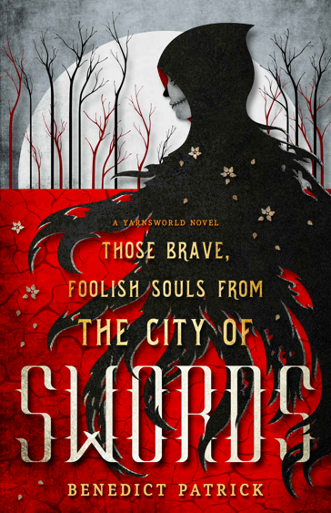
What to say about Benedict Patrick’s covers?
All of Benedict’s covers, designed by Jenny Zemanek from Seedlings Design Studio, are just gorgeous. They draw the eye, they tell a story, and give the books this aesthetic that somehow sticks in your mind as you read them. This one, with its bold red and black colours, is perhaps the pick of the lot.
I also particularly love that this cover has been made entirely by a graphic designer. It’s proof that you don’t need to break the bank to hire a fantastic artist (though, as the other covers in this list show, it can help) to have a really gorgeous cover.
If you’re an indie author who doesn’t quite have the ability to drop thousands on a cover, graphic-designed covers are still a valid option – provided that you find someone with the talent.
1. Assassin’s Fate by Robin Hobb
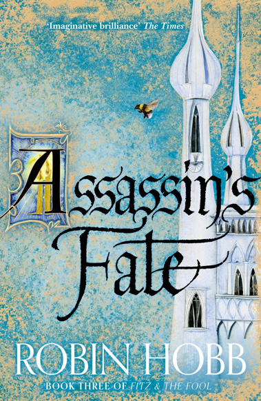
I feel like a digital image of this cover doesn’t do it justice.
Honestly though, holding this in hand, with the gold-foil-effect dustjacket, seeing the white towers, the bee, the candles… This cover is just breath-taking, and that effect is magnified by the connection you gain with Hobb’s characters as you read.
In the end, nothing was going to beat this cover, and in my opinion it’s the best of all of Jackie Morris’ covers for the Realm of the Elderlings.
Honourable Mentions
A Conjuring of Light by V. E. Schwab
Arm of the Sphinx (Orbit edition) by Josiah Bancroft
The Emerald Blade by Steven Kelliher